Riding The Gravy Train: March 2013

Riding The Gravy Train

Beating the market is fun and profitable. This is how we do it.

Saturday, March 30, 2013

SH Chart Update, S&P Negative Earnings Guidance at 7-year Highs

On March 07 we effectively shorted U.S. equities.

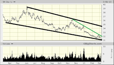
Here's an updated chart of SH, the ProShares Short S&P500 ETF:


In the original post we wrote that the chart does not yet show any bullish indicators, however that'd change above the green line which was then circa $32.  We'd now call a bullish turn upon any close above $31, still using that green line as the key trend to be broken.   

Worth considering is "Negative Earnings Guidance at Seven Year Highs", from which we show this chart:


We receive no remuneration or incentive directly or indirectly in any way, shape, or form for buying or selling the positions we do, or for mentioning any positions or companies in this blog. If we hold existing positions we divulge the fact. This blog is merely a diary of some of our thoughts and trades and is in no way whatsoever to be considered investment advice of any kind. Always without fail consult a competent, experienced, and honest broker or investment advisor before making any investment or speculative decisions.

 Please presume that we, she, he, I, it, them, they, us and you are purely fictional characters and that everything written in this blog is satire intended for comedic amusement only and not to be taken seriously in any way. Just like "real" analyst proclamations. Thank you. 


To be notified when this blog is updated : Please e-mail christianguinness@hotmail.com with "Subscribe to blog" in the subject line or click here to do so automatically if your computer is configured accordingly. We have never shared our mailing list with anyone, nor will we. Please note that we only send update notifications when a trade idea is diarized or updated, not if a blog entry only contains general commentary.

Wednesday, March 27, 2013

EPV, ProShares UltraShort MSCI Europe ETF, "Dr. Doom" Marc Faber and Housing

EPV, the ProShares UltraShort MSCI Europe ETF, showing a 9-month downtrend broken:


"Dr. Doom" Marc Faber: Not Even Gold Will Be Able To Save You From What Is Coming


This article is worth considering, in re: housing. 


We receive no remuneration or incentive directly or indirectly in any way, shape, or form for buying or selling the positions we do, or for mentioning any positions or companies in this blog. If we hold existing positions we divulge the fact. This blog is merely a diary of some of our thoughts and trades and is in no way whatsoever to be considered investment advice of any kind. Always without fail consult a competent, experienced, and honest broker or investment advisor before making any investment or speculative decisions.

Please presume that we, she, he, I, it, them, they, us and you are purely fictional characters and that everything written in this blog is satire intended for comedic amusement only and not to be taken seriously in any way. Just like "real" analyst proclamations. Thank you. 


To be notified when this blog is updated : Please e-mail christianguinness@hotmail.com with "Subscribe to blog" in the subject line or click here to do so automatically if your computer is configured accordingly. We have never shared our mailing list with anyone, nor will we. Please note that we only send update notifications when a trade idea is diarized or updated, not if a blog entry only contains general commentary.

Look Out Below! (Silver Update)

For context, please see "Silver Update, DJIA on an Inflation-Adjusted Basis is Nowhere Near All-Time Highs" and "CME Cuts Commodity Margins".

Today we update the silver chart:


Res ipsa loquitur.  [Latin, legal term meaning "the thing speaks for itself"]


Here's an updated chart of ZSL, the ProShares UltraShort Silver ETF:


Precious metals bulls often say that "most people don't yet own precious metals".  As shown by this graphic published a few days ago, people that actually have money to invest actually already own plenty of precious metals:


Perhaps we should've written "own plenty for now".  If silver falls much further, another cascade could occur. 

Look out below!


We receive no remuneration or incentive directly or indirectly in any way, shape, or form for buying or selling the positions we do, or for mentioning any positions or companies in this blog. If we hold existing positions we divulge the fact. This blog is merely a diary of some of our thoughts and trades and is in no way whatsoever to be considered investment advice of any kind. Always without fail consult a competent, experienced, and honest broker or investment advisor before making any investment or speculative decisions.

Please presume that we, she, he, I, it, them, they, us and you are purely fictional characters and that everything written in this blog is satire intended for comedic amusement only and not to be taken seriously in any way. Just like "real" analyst proclamations. Thank you. 


To be notified when this blog is updated : Please e-mail christianguinness@hotmail.com with "Subscribe to blog" in the subject line or click here to do so automatically if your computer is configured accordingly. We have never shared our mailing list with anyone, nor will we. Please note that we only send update notifications when a trade idea is diarized or updated, not if a blog entry only contains general commentary.

Monday, March 25, 2013

Prudence Is Never A Match For Greed


At the top everyone was touting the supposed wisdom of gold mining company executives, supposedly the industry's best, brightest, and most experienced people.

Consider that they were doing the wrong thing at the wrong time:  Gold Giants Shrink to Fit as Paulson Pushes Breakup

They were hedged at the lows, buying at the highs, and abandoning hedges at the top.  At the peak of a gold and silver boom of historic proportion it seems the only successful mining was done in the pockets of investors.  

Human nature is consistent, and prudence is never a match for greed. 

Recall at the peak of the tech boom, the real estate boom, and the uranium boom, to name but three in the past decade, all the scrambling to buy companies or properties at the highs.

That too is worth considering in light of the charts and statistics we've been presenting here the past several weeks.


We receive no remuneration or incentive directly or indirectly in any way, shape, or form for buying or selling the positions we do, or for mentioning any positions or companies in this blog. If we hold existing positions we divulge the fact. This blog is merely a diary of some of our thoughts and trades and is in no way whatsoever to be considered investment advice of any kind. Always without fail consult a competent, experienced, and honest broker or investment advisor before making any investment or speculative decisions.

Please presume that we, she, he, I, it, them, they, us and you are purely fictional characters and that everything written in this blog is satire intended for comedic amusement only and not to be taken seriously in any way. Just like "real" analyst proclamations. Thank you.


To be notified when this blog is updated : Please e-mail christianguinness@hotmail.com with "Subscribe to blog" in the subject line or click here to do so automatically if your computer is configured accordingly. We have never shared our mailing list with anyone, nor will we. Please note that we only send update notifications when a trade idea is diarized or updated, not if a blog entry only contains general commentary.

Friday, March 22, 2013

GS, Goldman Sachs Chart Update


Goldman's share price often leads the market, simply by virtue that it's "the" financial stock and financials have been "the" sector for years now. 

On February 19, we posted this chart of GS:


At the time, we wrote: "Market bulls should view this with serious concern.  With the green lines in the chart above we illustrate a massive "rising wedge" pattern which should soon break down.  Upside momentum measures for Goldman Sachs are currently at decade-long extremes.  Probably it'll meet the black uptrend later this year."

It so happens that was the exact top, and the Goldman Sachs chart now looks like this: 


A chart of the overall market should soon look the same, and we remain confident that GS will connect with its uptrend (in black) later this year while the DJIA proceeds to drop at least 800-1000 points from its recent highs.

Here are some recent posts detailing why we believe so:

Market Update

Sobering Stats, DJIA RSI Suggests Imminent Plunge

Fractals Are Fun

Fun With Fractions and Coincidences

DJIA RSI Update, VIX Update & Random Notes


Neat:  Car that runs on air and water.


We receive no remuneration or incentive directly or indirectly in any way, shape, or form for buying or selling the positions we do, or for mentioning any positions or companies in this blog. If we hold existing positions we divulge the fact. This blog is merely a diary of some of our thoughts and trades and is in no way whatsoever to be considered investment advice of any kind. Always without fail consult a competent, experienced, and honest broker or investment advisor before making any investment or speculative decisions.

Please presume that we, she, he, I, it, them, they, us and you are purely fictional characters and that everything written in this blog is satire intended for comedic amusement only and not to be taken seriously in any way. Just like "real" analyst proclamations. Thank you. 


To be notified when this blog is updated : Please e-mail christianguinness@hotmail.com with "Subscribe to blog" in the subject line or click here to do so automatically if your computer is configured accordingly. We have never shared our mailing list with anyone, nor will we. Please note that we only send update notifications when a trade idea is diarized or updated, not if a blog entry only contains general commentary.

Thursday, March 21, 2013

Buying OTS, Canadian Oilfield Solutions


Click here to hear an "interview" with Ken Berg, President and CEO of Canadian Oilfield Solutions Corp.

Our interest is in the charts.  We'll start with the weekly view, in which we see a downtrend broken and possible uptrend and imminent breakout:


We've been watching it for months and hold an existing position at an average price of $0.16 

Here's a closer look:

We like the steady accumulation and recent rise in volume.  However the price has not gone up with volume or with a global equities rally of historic proportions, and the junior venture arena remains out of favor to put it politely, so the higher likelihood is an eventual breakdown in price and if that happens we'll sell on any close below $0.14 

That's a very tight stop in an attempt to limit risk to the current trend (in red).  With a major stock market reversal likely dead ahead, and a very possible further drop in gold and silver which would hit Canadian shares of all types especially hard, we'll play it prudently.

If it begins to close regularly above $0.175 we'd become very bullish and probably add shares. 


We receive no remuneration or incentive directly or indirectly in any way, shape, or form for buying or selling the positions we do, or for mentioning any positions or companies in this blog. If we hold existing positions we divulge the fact. This blog is merely a diary of some of our thoughts and trades and is in no way whatsoever to be considered investment advice of any kind. Always without fail consult a competent, experienced, and honest broker or investment advisor before making any investment or speculative decisions.

Please presume that we, she, he, I, it, them, they, us and you are purely fictional characters and that everything written in this blog is satire intended for comedic amusement only and not to be taken seriously in any way. Just like "real" analyst proclamations. Thank you.


To be notified when this blog is updated : Please e-mail christianguinness@hotmail.com with "Subscribe to blog" in the subject line or click here to do so automatically if your computer is configured accordingly. We have never shared our mailing list with anyone, nor will we. Please note that we only send update notifications when a trade idea is diarized or updated, not if a blog entry only contains general commentary.

Tuesday, March 19, 2013

DJIA RSI Update, VIX Update & Random Notes


It's obviously still very early in the week, but for now the weekly RSI for the DJIA seems to be turning down.  This is even more often indicative of an imminent significant sell-off than the weekly RSI simply rising to its recent levels above 73.  Click here for context, to read a recent posting entitled Sobering Stats, DJIA RSI Suggests Imminent Plunge.

An interesting gold news item:  India Gold ETF Sales Mimic Soros as Goldman More Bearish

Below is a sobering chart credited to dshort.com   We warned of extremes in margin debt a month ago in our February 16 Market Update


Friday, before the market opened, we posted this chart of the VIX index (scroll to bottom).  Here's an updated version:


JPMorgan wins dismissal of silver price-fixing lawsuit.


We receive no remuneration or incentive directly or indirectly in any way, shape, or form for buying or selling the positions we do, or for mentioning any positions or companies in this blog. If we hold existing positions we divulge the fact. This blog is merely a diary of some of our thoughts and trades and is in no way whatsoever to be considered investment advice of any kind. Always without fail consult a competent, experienced, and honest broker or investment advisor before making any investment or speculative decisions.

 Please presume that we, she, he, I, it, them, they, us and you are purely fictional characters and that everything written in this blog is satire intended for comedic amusement only and not to be taken seriously in any way. Just like "real" analyst proclamations. Thank you.


To be notified when this blog is updated : Please e-mail christianguinness@hotmail.com with "Subscribe to blog" in the subject line or click here to do so automatically if your computer is configured accordingly. We have never shared our mailing list with anyone, nor will we. Please note that we only send update notifications when a trade idea is diarized or updated, not if a blog entry only contains general commentary.

Monday, March 18, 2013

Cyprus Is Immaterial and Dr. Copper Is Still Unhappy


For context of today's post, please review this recent short post on copper.

Today we offer updated charts, which can be clicked for larger views.

First the daily, in which we see the continuing breakdown we'd expected is occurring (below thicker red ascending trend line) and there may be support near current levels for a bounce (lower black horizontal line):


Now the weekly view.  Once "Doctor Copper" breaks below the longer-term uptrend, there'll be one more serious problem for market bulls:


You may have heard that today's selling was due to Cyprus banking & bailout concerns.  (No link provided - if you're unaware of it consider yourself lucky since nothing has been determined or resolved yet, and the speculation and misinformation often borders on the ridiculous.)

The selling seems totally unrelated to Cyprus, or in other words the problems there are a non-issue (at least so far) to global markets including gold and silver.  Trading action and ranges were totally consistent with what would've seemed reasonable without the Cyprus scare and, considering the extremely overextended nature of recent market rallies worldwide, Monday was not only a light day for trading volume but also a very light day for selling.

European events continue, as they have for years, to be of no apparent concern to investors and if as is often the case a "surprise" so-called "solution" is offered by those that created the mess in the first place, we shouldn't be surprised to see markets once again at new all-time highs in the coming days.  Irony abounds, and what "should" happen is seldom what does happen. 

We remain bearish and short in any case.


We receive no remuneration or incentive directly or indirectly in any way, shape, or form for buying or selling the positions we do, or for mentioning any positions or companies in this blog. If we hold existing positions we divulge the fact. This blog is merely a diary of some of our thoughts and trades and is in no way whatsoever to be considered investment advice of any kind. Always without fail consult a competent, experienced, and honest broker or investment advisor before making any investment or speculative decisions.

Please presume that we, she, he, I, it, them, they, us and you are purely fictional characters and that everything written in this blog is satire intended for comedic amusement only and not to be taken seriously in any way. Just like "real" analyst proclamations. Thank you.


 To be notified when this blog is updated : Please e-mail christianguinness@hotmail.com with "Subscribe to blog" in the subject line or click here to do so automatically if your computer is configured accordingly. We have never shared our mailing list with anyone, nor will we. Please note that we only send update notifications when a trade idea is diarized or updated, not if a blog entry only contains general commentary.


Friday, March 15, 2013

Buying YCL, Long the Japanese Yen, VIX at 6-year Lows


Today we offer a chart depicting both the Nikkei 225 on top and the yen at bottom.  Please be reminded that all graphics can be clicked to view a larger version.

Clearly the two have been inversely correlated for years, and we marvel that this index has risen an incredible 45% in four months, into an area of probable resistance between the two black horizontal lines:


The black arrows on the yen portion of the chart show the clear correlation to extremes in commercial hedgers (green) positioning.  This suggests that the current extreme, now lasting an unusual length of several months, could signal a near-term reversal in the yen.

Below is a close-up of the NIKKEI and yen showing that the inverse correlation may have ended the past week, which is a possible indication that the downward move in the currency is done and that a bounce is about to occur. 

Perhaps it'll be a massive short squeeze, as shorting the yen has been a very popular and profitable position.  You can see in the chart above that small traders have shorted it to extremes, and typically small traders don't do well for very long.


YCL is an ETF that's levered long the yen, and that's how we've chosen to play it, having entered half the desired position Thursday and we'll enter the other half Friday morning.  The usual caveats with respect to levered ETF's apply.  We'll put a closing stop at  $21.60 thereby risking approximately 5%

YCL may enjoy support at its current level, per the red line in this chart:


Today the VIX index hit a 6-year low while the DJIA set a 16-year record with 10 successive positive days. 

Here's a 6-month chart of the VIX which suggests a reversal in equities is due soon, as there appears to be a broken downtrend above (red) and a supportive trend below (black):


We receive no remuneration or incentive directly or indirectly in any way, shape, or form for buying or selling the positions we do, or for mentioning any positions or companies in this blog. If we hold existing positions we divulge the fact. This blog is merely a diary of some of our thoughts and trades and is in no way whatsoever to be considered investment advice of any kind. Always without fail consult a competent, experienced, and honest broker or investment advisor before making any investment or speculative decisions.

Please presume that we, she, he, I, it, them, they, us and you are purely fictional characters and that everything written in this blog is satire intended for comedic amusement only and not to be taken seriously in any way. Just like "real" analyst proclamations. Thank you. 


To be notified when this blog is updated : Please e-mail christianguinness@hotmail.com with "Subscribe to blog" in the subject line or click here to do so automatically if your computer is configured accordingly. We have never shared our mailing list with anyone, nor will we. Please note that we only send update notifications when a trade idea is diarized or updated, not if a blog entry only contains general commentary.

Thursday, March 14, 2013

Coincidence?


This post is a continuation of this one posted yesterday, in which the promise was made that one more compelling reason for the 2/3 ratio would be offered.

From the strange-but-true category ...

Here's a look at the DJIA weekly chart, with two trends of obvious resistance illustrated:


Here's a 2nd look at it, showing that the angle of the 1st trend is roughly 18%:


2/3 of 18% is 12.  Here's a close-up chart of the 2nd section showing the angle of the 2nd trend:


Bonus:  Notice the red line at the bottom of the 2nd chart which shows the declining trend in volume.  We now have about 2/3 the volume and we can also see that when volume spikes it's when the market is dropping.

Given this week has seen some of the lightest volume days of the year so far, in fact some of the lightest volume days of the past several years, and given that the market is overdue to slide, it seems plausible that we'll soon have another event of volume rising above the red trend line as the market plunges.

Extra-Bonus: Notice that the 2nd chart above is a weekly view of the DJIA.  The 3rd chart is a daily view.  It's not just the resistance lines that are similar, but the chart themselves and the volume decline look virtually identical.  That's another way of considering yesterday's charts.


As was recently illustrated here and here, market turns have happened almost like clockwork the past few years.  Or should we say "calendar work"?


In fact, in all of the past seven years significant market turns began in the March-April time frame. 

Not shown in the above chart is 2007, in which the bottom was in March.  In 2006 there was a high in April that was followed by a significant sell-off.  The market did not hit new highs until late September.

Going back further, in 2004 through 2005 the market was essentially flat, with no major turns.  In 2003 the low was in March.  In 2002 the high was in March.  In 2001 the high was in May.  In 2000 the low was in March.


We've been talking about the DJIA here, as we always do, so for a change let's look at how this manifested in the S&P500:


In the 4-year chart above, on which we note the current trend of resistance that's immediately above present levels, as well as the steadily-declining volume, we've drawn a series of "ascending triangle" patterns.  It's easy to see that we're at or near the end of another such pattern.


Maybe it'll end differently this time?  We'll know soon enough, so for now let's consider a few more coincidences and charts.

The Daily Sentiment Index (per Trade-Futures.com) is notching its highest extreme since early May of 2011.  After that peak, the Dow declined 19% over the following five months.

Market Vane's Bullish Consensus is at a 6-year extreme.  The last time it was almost this high was just before the plunge last year from September into November during which the DJIA lost 1200 points or 8.8%  The Bullish Consensus reading was almost as high just before the market tanked last year from mid-March into June, during which the DJIA lost 1300 points or 9.7% 

The previous time it was nearly as high was just before the market cascaded from April-October 2011 during which the DJIA lost almost 2500 points or 19%


In this chart we show the NASDAQ, with a potential triple-top formation along the line of apparent resistance:


Here's that same chart, on which we've simply copied the 1st rally and pasted it on the right.  Compare it with the chart above.  There's very little difference between the two - the length and height are essentially the same.


That would only be a coincidence if the market starts dropping imminently, as would this be a whopper of a coincidence ... back to the S&P500 for a 20-year view this time, on which we also see a possible triple-top:


Lastly, a bit of spooky fun with the S&P500 and 2/3.  The bear market low for the S&P500 in 2009 was 666.  2/3 is of course also commonly expressed as .666


We receive no remuneration or incentive directly or indirectly in any way, shape, or form for buying or selling the positions we do, or for mentioning any positions or companies in this blog. If we hold existing positions we divulge the fact. This blog is merely a diary of some of our thoughts and trades and is in no way whatsoever to be considered investment advice of any kind. Always without fail consult a competent, experienced, and honest broker or investment advisor before making any investment or speculative decisions.

 Please presume that we, she, he, I, it, them, they, us and you are purely fictional characters and that everything written in this blog is satire intended for comedic amusement only and not to be taken seriously in any way. Just like "real" analyst proclamations. Thank you.


To be notified when this blog is updated : Please e-mail christianguinness@hotmail.com with "Subscribe to blog" in the subject line or click here to do so automatically if your computer is configured accordingly. We have never shared our mailing list with anyone, nor will we. Please note that we only send update notifications when a trade idea is diarized or updated, not if a blog entry only contains general commentary.

Wednesday, March 13, 2013

Fun With Fractions and Coincidences


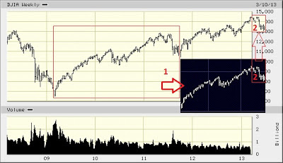
Here's a different look at the chart presented yesterday


This time, we copied the entire section in box 1 (outlined in red) and shrunk it by 2/3 (shown in the black box). 

Why 2/3?  Why not?  It seemed to fit well, is close to the "Golden Ratio", it's a common ratio in technical analysis, and as can be seen at bottom of the chart the volume for the year-and-a-half from late 2011 until now (2nd section of rally from the 2009 lows) has been roughly 2/3 of the volume for the year-and-a-half period from early 2009 until late 2011 (first section of the rally from the 2009 lows).

Given this is all pure conjecture and that this type of analysis is not our usual beat, we won't try to rationalize this, however we'll present one more compelling reason for the 2/3 ratio tomorrow.


Interestingly, if the contents of the black rectangle were overlaid on the actual market chart, the highs would be at the exact same level which the market currently trades. In other words, our arbitrary 2/3 ratio results in not just the exact length but also the exact height of what we're calling the 2nd half of the rally from the 2009 lows.  Of course this is only true, and extremely impressive, if there's a top occurring in the market currently.  Admittedly, that's a very big "if". 

And if that is the case, this chart suggests that the coming drop will end near the 13100 level circa mid-June (as per box 2 in the chart, which is copied & pasted directly from black rectangle below).  That happens to represent a 2/3 correction of the rally from the lows of mid-November 2012.  Keep this 13100 level and mid-June time frame in mind as you read the next two paragraphs.

In 2012 the DJIA started with a 9.3% virtually uninterrupted rally that essentially topped-out in mid-March.  By mid-June it hit the year's lows, almost exactly 9.3% down from the March highs, ending just below the level at which the market began the year.

In 2013 the DJIA has started with a 10.2% virtually uninterrupted rally to mid-March.  A drop to the 13100 level in mid-June would be 9.3% - basically the exact same percentage as the rally and the subsequent drop during the first six months of 2012, in the exact same time frame, and also similar to 2012 it'd end just below where the DJIA started the calendar year.   

Another coincidence, that'd be exactly where the uptrend from the 2009 lows will be in mid-June.  See the red line:


That seems like a large and quick plunge for a market that hasn't even had a 3-day drop this year, but if anything a 9.3% slide would arguably be a minor and common correction given the stats presented here.

Our own belief, for a great many reasons including those detailed herein the past few weeks, is that the DJIA is more likely to drop to between 13500 and 13800.  That's if 1/2 to 2/3 of the spike from January 1st is corrected, and that range just happens to be where the uptrend from the 2009 lows will be mid-June on a logarithmic scale. That'll also be where the 200-day moving average for the market should be by then.


We receive no remuneration or incentive directly or indirectly in any way, shape, or form for buying or selling the positions we do, or for mentioning any positions or companies in this blog. If we hold existing positions we divulge the fact. This blog is merely a diary of some of our thoughts and trades and is in no way whatsoever to be considered investment advice of any kind. Always without fail consult a competent, experienced, and honest broker or investment advisor before making any investment or speculative decisions.

Please presume that we, she, he, I, it, them, they, us and you are purely fictional characters and that everything written in this blog is satire intended for comedic amusement only and not to be taken seriously in any way. Just like "real" analyst proclamations. Thank you.


To be notified when this blog is updated : Please e-mail christianguinness@hotmail.com with "Subscribe to blog" in the subject line or click here to do so automatically if your computer is configured accordingly. We have never shared our mailing list with anyone, nor will we. Please note that we only send update notifications when a trade idea is diarized or updated, not if a blog entry only contains general commentary.

Tuesday, March 12, 2013

Fractals Are Fun


Here's a 5-year chart of the DJIA:


Box 1 was copied and replicated exactly, though resized smaller, into boxes 2, 3, and 4. 

To us it looks as though the actual path of the market replicated the path of the segment within the box below with very little variation. 

We don't suggest this is necessarily indicative or predictive of anything, however we do note that along with this apparently repeating pattern there has been a major reversal sometime between February and April in each of the past four years.

We also note that so far this year a reversal has not occurred, there hasn't even been three down days in succession, and the market is at or very near the point in the pattern at which a reversal occurs.


We receive no remuneration or incentive directly or indirectly in any way, shape, or form for buying or selling the positions we do, or for mentioning any positions or companies in this blog. If we hold existing positions we divulge the fact. This blog is merely a diary of some of our thoughts and trades and is in no way whatsoever to be considered investment advice of any kind. Always without fail consult a competent, experienced, and honest broker or investment advisor before making any investment or speculative decisions.

Please presume that we, she, he, I, it, them, they, us and you are purely fictional characters and that everything written in this blog is satire intended for comedic amusement only and not to be taken seriously in any way. Just like "real" analyst proclamations. Thank you. 


To be notified when this blog is updated : Please e-mail christianguinness@hotmail.com with "Subscribe to blog" in the subject line or click here to do so automatically if your computer is configured accordingly. We have never shared our mailing list with anyone, nor will we. Please note that we only send update notifications when a trade idea is diarized or updated, not if a blog entry only contains general commentary.

Monday, March 11, 2013

Sobering Stats, DJIA RSI Suggests Imminent Plunge


Currently the weekly RSI on the Dow Jones Industrial Average is reading slightly above 73.

The previous time it was over 73 was April 23, 2011. That marked the DJIA's closing high for the year at 12810. Six months later the low for the year was hit at 10404, a drop of 2496 points or 18.8%

In mid-February of 2011 the weekly RSI also crossed 73 when the DJIA was circa 12100, and in that instance the market went a little higher before tanking as noted in the paragraph above. 

In 2010 the weekly RSI only managed a high of 72.5 and at that time the DJIA was closing at 11205.  It's interesting to note that this too occurred in April.  Three months later a low of 9614 was hit, making for a drop of  1591 points or 14.1%

In 2008 and 2009 the weekly RSI did not get above 70.

In May of 2007 the weekly RSI hit the year's high at just above 73 while the DJIA was at 13690. Five months later what was until recently the all-time high was hit at 14198, however en-route to that high it first dropped to a low of 12518 in the middle of August, which was 1172 points or 8.5% lower.

After that October all-time high in 2007, at which point the weekly RSI was only 65, the market collapsed virtually non-stop for two-and-a-half years to 6627, a drop of 7571 points or 53.3%

We need to go back to December of 2003 to find another instance of the weekly RSI above 73.  The DJIA was then at 10350 and essentially went sideways for two years before continuing higher.  The subsequent low over those two years was 9708 while the high was 10960.

April 1999 is the previous time the weekly RSI hit 73. The DJIA was at 10500 and essentially went sideways for the next two years with a high of 11750 and a low of 9375 during that period. Afterward, from a high of 11350 in 2001 the market tanked to a low of 7198 in October of 2002. That was a drop of 4152 points or 36.6%

For a bit of balance we'll note that through the mid-90's the weekly RSI hit 73 many times while the DJIA enjoyed a multi-year bull market of historic proportions.

Arguably things were very different then, and very much more bullish economically in the U.S. and globally. Perhaps that matters. Perhaps not, and we somehow now find ourselves at the equivalent of 1993.

Whatever the case, based on this indicator we can reasonably expect at least a 1000-point drop in the DJIA before long. We note that this would bring the DJIA back to its current long-term uptrend as shown in red on this chart:


We receive no remuneration or incentive directly or indirectly in any way, shape, or form for buying or selling the positions we do, or for mentioning any positions or companies in this blog. If we hold existing positions we divulge the fact. This blog is merely a diary of some of our thoughts and trades and is in no way whatsoever to be considered investment advice of any kind. Always without fail consult a competent, experienced, and honest broker or investment advisor before making any investment or speculative decisions.

Please presume that we, she, he, I, it, them, they, us and you are purely fictional characters and that everything written in this blog is satire intended for comedic amusement only and not to be taken seriously in any way. Just like "real" analyst proclamations. Thank you.


To be notified when this blog is updated : Please e-mail christianguinness@hotmail.com with "Subscribe to blog" in the subject line or click here to do so automatically if your computer is configured accordingly. We have never shared our mailing list with anyone, nor will we. Please note that we only send update notifications when a trade idea is diarized or updated, not if a blog entry only contains general commentary.

It's That Easy!


16-year-old actress turns day-trader.

Certainly she doesn't remember 1999 but, like, do you? 

Don't worry though, this might not be a sure sign of a top this time around. Given that, like, she's been day-trading for over a year now and, like, has been doing great, maybe the scary fact that she's looking to short means the DJIA will hit 36000 soon!?

LOL!


We receive no remuneration or incentive directly or indirectly in any way, shape, or form for buying or selling the positions we do, or for mentioning any positions or companies in this blog. If we hold existing positions we divulge the fact. This blog is merely a diary of some of our thoughts and trades and is in no way whatsoever to be considered investment advice of any kind. Always without fail consult a competent, experienced, and honest broker or investment advisor before making any investment or speculative decisions.

Please presume that we, she, he, I, it, them, they, us and you are purely fictional characters and that everything written in this blog is satire intended for comedic amusement only and not to be taken seriously in any way. Just like "real" analyst proclamations. Thank you. 


To be notified when this blog is updated : Please e-mail christianguinness@hotmail.com with "Subscribe to blog" in the subject line or click here to do so automatically if your computer is configured accordingly. We have never shared our mailing list with anyone, nor will we. Please note that we only send update notifications when a trade idea is diarized or updated, not if a blog entry only contains general commentary.

Thursday, March 07, 2013

Silver Update, DJIA on an Inflation-Adjusted Basis is Nowhere Near All-Time Highs


We've realized some massive gains shorting silver per this blog, and we maintain our bearish stance and long-term short position.

On August 11, 2011 we stated: "It's a great time to short silver."  The subsequent high in silver came on August 22nd, and by late September the suggested short position was over 60% higher.  We booked a 62% gain on half of it "to be prudent" and held the rest in keeping with our long-term bearish view against the opinion of all supposed experts.

Silver then rallied significantly and on February 09, 2012 we added to the silver short to bring it back to a full position.  Silver topped later that month and hasn't been higher since.  Our suggested position was 53% higher by mid-May, though unfortunately we were stopped out for a very small loss before it skyrocketed.  We did retain the original 1/2 short position for the long term, as we diarized at the time.

In mid-may of 2012 we presented this chart: Silver May 15 2012.  We wrote: "A bounce could be significant and soon.  We'll stick with our long-standing silver short position."

A massive bounce began the next day, and by September silver was nearly 50% higher. 

February of this year we offered this chart: Silver February 20, 2013

Today we post an update to show that a 4.5-year up-trend in silver is quite possibly over.  This strongly suggests that the low-$20 range will be hit, and we believe silver will go much lower thereafter.  Here's that chart:


The same persons offer e-mockery and abuse every time we write anything bearish about silver or gold. They have no proven track record, other than of being wrong, so we consider their anger a confirmation of our position. Not even one of the world's most celebrated speculators is making money via long positions in precious metals: "Paulson Gold Fund Down 18% as Metal’s Slump Foils Rebound".

Of course the bulls celebrated all across the internet when Paulson bought into gold, but now they're silent just as they ignore another widely-touted buyer selling for a loss.  As we reported here in February, "George Soros Dumps Gold As Prices Sink".  To be fair, Paulson hasn't sold for a loss.  Yet. 

Like Paulson, many are holding on and are now in the red as they bought or averaged-up at the highs. Now as gold and silver continue to drop lower the margin calls will ring out and then it'll get very ugly for those who have yet to learn that what goes up must come down, and that no amount of armchair economists, poor logic based on bogus data, or ridiculous conspiracy theories (naked shorts, GATA, et. al.) will keep the price up.

Bonus chart below, found on Fred's Intelligent Bear site.  It shows that on an inflation-adjusted basis the DJIA is nowhere near all-time highs.  We also note that the DJIA's highs are unconfirmed thus far by the S&P, NASDAQ, and most importantly in our opinion by Goldman Sachs. 


We receive no remuneration or incentive directly or indirectly in any way, shape, or form for buying or selling the positions we do, or for mentioning any positions or companies in this blog. If we hold existing positions we divulge the fact. This blog is merely a diary of some of our thoughts and trades and is in no way whatsoever to be considered investment advice of any kind. Always without fail consult a competent, experienced, and honest broker or investment advisor before making any investment or speculative decisions.

Please presume that we, she, he, I, it, them, they, us and you are purely fictional characters and that everything written in this blog is satire intended for comedic amusement only and not to be taken seriously in any way. Just like "real" analyst proclamations. Thank you.


To be notified when this blog is updated : Please e-mail christianguinness@hotmail.com with "Subscribe to blog" in the subject line or click here to do so automatically if your computer is configured accordingly. We have never shared our mailing list with anyone, nor will we. Please note that we only send update notifications when a trade idea is diarized or updated, not if a blog entry only contains general commentary.

Buying SH to Effectively Short the Stock Market


We entered a market short position as a hedge on January 25.  Since then, VXX and HUV have both been over 16% higher.  As for the options, which we did not take positions in, the February VXX calls were a bust while the March calls popped as much as 80% higher. 

At the time we wrote: "We won't use a stop level as for us these are to hedge market risk per existing long positions (not diarized herein) in general equities."

This worked perfectly since our long positions have appreciated significantly while stock markets have gone much higher.  Meanwhile our levered short position in VXX, after offering good gains at one point, is now only slightly lower than our entry. 

We now wish to go from being well-hedged to net short the market.  We'll do so via SH, the ProShares Short S&P500 ETF.  It is non-levered.  Should markets continue higher without correction, we'll probably add a levered short, or sell off long positions, to become almost entirely short. 
 
Below is a chart of SH.  We hope that the lower trend line will prove supportive.  It's currently not tripping any bullish technical indications, however it would do so above the green line which is currently at roughly $32.


We will not consider a stop level for SH at this time.


We receive no remuneration or incentive directly or indirectly in any way, shape, or form for buying or selling the positions we do, or for mentioning any positions or companies in this blog. If we hold existing positions we divulge the fact. This blog is merely a diary of some of our thoughts and trades and is in no way whatsoever to be considered investment advice of any kind. Always without fail consult a competent, experienced, and honest broker or investment advisor before making any investment or speculative decisions.

Please presume that we, she, he, I, it, them, they, us and you are purely fictional characters and that everything written in this blog is satire intended for comedic amusement only and not to be taken seriously in any way. Just like "real" analyst proclamations. Thank you.


To be notified when this blog is updated : Please e-mail christianguinness@hotmail.com with "Subscribe to blog" in the subject line or click here to do so automatically if your computer is configured accordingly. We have never shared our mailing list with anyone, nor will we. Please note that we only send update notifications when a trade idea is diarized or updated, not if a blog entry only contains general commentary.

Tuesday, March 05, 2013

DJIA at Confluence of Multiple Trend Lines


Click for a larger view of the DJIA at a confluence of multiple trend lines:


We receive no remuneration or incentive directly or indirectly in any way, shape, or form for buying or selling the positions we do, or for mentioning any positions or companies in this blog. If we hold existing positions we divulge the fact. This blog is merely a diary of some of our thoughts and trades and is in no way whatsoever to be considered investment advice of any kind. Always without fail consult a competent, experienced, and honest broker or investment advisor before making any investment or speculative decisions.

Please presume that we, she, he, I, it, them, they, us and you are purely fictional characters and that everything written in this blog is satire intended for comedic amusement only and not to be taken seriously in any way. Just like "real" analyst proclamations. Thank you. 


To be notified when this blog is updated : Please e-mail christianguinness@hotmail.com with "Subscribe to blog" in the subject line or click here to do so automatically if your computer is configured accordingly. We have never shared our mailing list with anyone, nor will we. Please note that we only send update notifications when a trade idea is diarized or updated, not if a blog entry only contains general commentary.

Sunday, March 03, 2013

U.S. Dollar Going Higher, Gold Going Lower?


UUP is a 2x levered bullish U.S. dollar ETF.  Below is its weekly chart, suggesting a major upside break-out is underway. 

We've been extremely bullish the USD in this blog for years, contrary to all popular (read: mistaken) sentiment.  We flipped it several times for enormous gains, again per this blog, most recently purchasing it (and still holding) at the exact low of May 05 2011. 


Here's a chart of the U.S. dollar.  An actual break-out has not yet happened, however we're certain it will.


Of course this is more bad news for gold and silver (we've been correctly bearish for a long time, again against all popular sentiment), and most commodities. 

As can be seen in the chart above, the U.S. dollar bottomed in 2008.  The chart presents an empirical problem for the "dollar is doomed" crowd, armchair economists and Nobel laureates alike. 

Is the dollar only up vs. other currencies, rather than "real money" and commodities? 


Crude Oil topped mid-2008 and is way down since then, dropping as much as 75% since "peak oil" made higher oil prices that'd supposedly cripple global commerce and movement an "absolute certainty".

Natural Gas is way down from mid-2008, dropping as much as 84% as of 2012.

Heating Oil?  Essentially mirrored crude oil.

Perhaps this is just particular to the energy sector?


Gold is down 17% from its 2011 high.

Silver is down 42% since its 2011 high. 

Platinum down as much as 66% from its 2008 high.

Copper down as much as 35% from its 2011 high.

With insurance like that against Federal Reserve money "printing", who needs an understanding of human nature, herd mentality and history?


Yes we're cherry-picking dates to some degree to make a point, however five years is a very long time for energy to not only fail to make new highs but to instead drop very materially and lag equities significantly despite all the doomsday "wisdom" and "certainty" regarding the dollar's "imminent demise". 

So too for metals, two years is a very long time and we believe the next two years will feel like an eternity for those who continue to slag the dollar and accumulate gold and silver in a misguided attempt to "buy the dips".

Cash is once again clearly king.  Should the market finally plunge awhile, as seems imminent, that fact will become clear to a great many more people. 


We receive no remuneration or incentive directly or indirectly in any way, shape, or form for buying or selling the positions we do, or for mentioning any positions or companies in this blog. If we hold existing positions we divulge the fact. This blog is merely a diary of some of our thoughts and trades and is in no way whatsoever to be considered investment advice of any kind. Always without fail consult a competent, experienced, and honest broker or investment advisor before making any investment or speculative decisions.

Please presume that we, she, he, I, it, them, they, us and you are purely fictional characters and that everything written in this blog is satire intended for comedic amusement only and not to be taken seriously in any way. Just like "real" analyst proclamations. Thank you.


To be notified when this blog is updated : Please e-mail christianguinness@hotmail.com with "Subscribe to blog" in the subject line or click here to do so automatically if your computer is configured accordingly. We have never shared our mailing list with anyone, nor will we. Please note that we only send update notifications when a trade idea is diarized or updated, not if a blog entry only contains general commentary.

Saturday, March 02, 2013

Pretty Pictures


Click these charts to enlarge, click the "back" button to return here.


Read our recent post on Dr. Copper.


Equities are not cheap:
 
 
 Equities could soon become cheap, however:


One wonders how many of these people are working for unreported cash:


A double-top in the real price of gold?


Charts courtesy Business Insider.  Amendments to the gold chart are ours.


We receive no remuneration or incentive directly or indirectly in any way, shape, or form for buying or selling the positions we do, or for mentioning any positions or companies in this blog. If we hold existing positions we divulge the fact. This blog is merely a diary of some of our thoughts and trades and is in no way whatsoever to be considered investment advice of any kind. Always without fail consult a competent, experienced, and honest broker or investment advisor before making any investment or speculative decisions.

Please presume that we, she, he, I, it, them, they, us and you are purely fictional characters and that everything written in this blog is satire intended for comedic amusement only and not to be taken seriously in any way. Just like "real" analyst proclamations. Thank you.


To be notified when this blog is updated : Please e-mail christianguinness@hotmail.com with "Subscribe to blog" in the subject line or click here to do so automatically if your computer is configured accordingly. We have never shared our mailing list with anyone, nor will we. Please note that we only send update notifications when a trade idea is diarized or updated, not if a blog entry only contains general commentary.

Friday, March 01, 2013

"Doctor" Copper Offers A Dire Diagnosis


Copper is commonly called "Doctor Copper, with a PhD in Economics" because global economic trends often follow demand, as expressed by price, for copper.  That's essentially because copper is so widely used in construction and industry worldwide.

Below are copper charts, daily then weekly, with the trend lines having obvious implications:


Here's an interesting chart of Apple, AAPL:


Last week we warned that Goldman Sachs was about to break down and that this would be problematic for market bulls, adding "probably it'll meet the black uptrend later this year."  The S&P and NASDAQ hit highs for the year (so far at least) a few hours later, while the DJIA went only slightly higher. 

Here's an updated chart of Goldman Sachs, GS:


We receive no remuneration or incentive directly or indirectly in any way, shape, or form for buying or selling the positions we do, or for mentioning any positions or companies in this blog. If we hold existing positions we divulge the fact. This blog is merely a diary of some of our thoughts and trades and is in no way whatsoever to be considered investment advice of any kind. Always without fail consult a competent, experienced, and honest broker or investment advisor before making any investment or speculative decisions.

Please presume that we, she, he, I, it, them, they, us and you are purely fictional characters and that everything written in this blog is satire intended for comedic amusement only and not to be taken seriously in any way. Just like "real" analyst proclamations. Thank you.


To be notified when this blog is updated : Please e-mail christianguinness@hotmail.com with "Subscribe to blog" in the subject line or click here to do so automatically if your computer is configured accordingly. We have never shared our mailing list with anyone, nor will we. Please note that we only send update notifications when a trade idea is diarized or updated, not if a blog entry only contains general commentary.